Bachelor Thesis: Accessibility in Gaming
Level Up Inclusion!
This was my Bachelor Thesis for my graduation at Danish School of Media and Journalism. The assignment was to create an idea or identity for an excisting company. I chose the live stream website Twitch, and created a countdown for a campaign concept, made for a community of gamers with disabilities, sharing the awareness of inclusion for everyone, in the gaming universe.
 Graduated Visual Communication in Interactive Design
Subjects: Interactive Design, Visual Identity, Motion Design
Concept Teaser
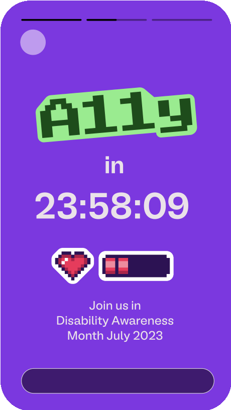
1337 and Numeronym
The word accessibility can be shortenend as A11y. This is called a numeronym: Shortening the word using the number of characters between the A and Y.
In the gaming community, 1337-speak (Leet) is commonly used as a reference to hacking, typing words with numbers instead of letters. The numeronym A11y is therefore, sometimes read as "ALLY". Here the title of the campaign is reffering to both 1337 and the numeronym for "Accessibility".
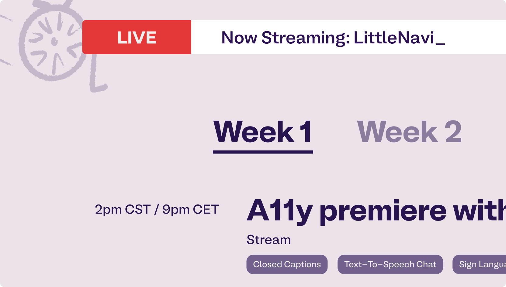
Product mockup
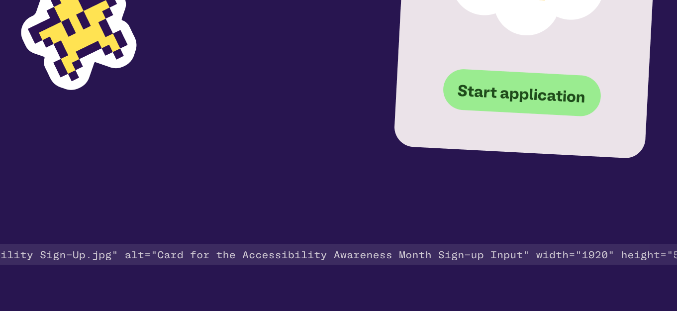
The interactive product I presented was a landing page for the campaign on Twitch, before the launch.
Bonus:
1. Motivating game developers to create accessible games.
2. Helping gamers understand how this may benefit everyone.
Why: Creating awareness around accessibility
What: Share experience among gamers about accessibility
How: Include gamers from several different disabled communities

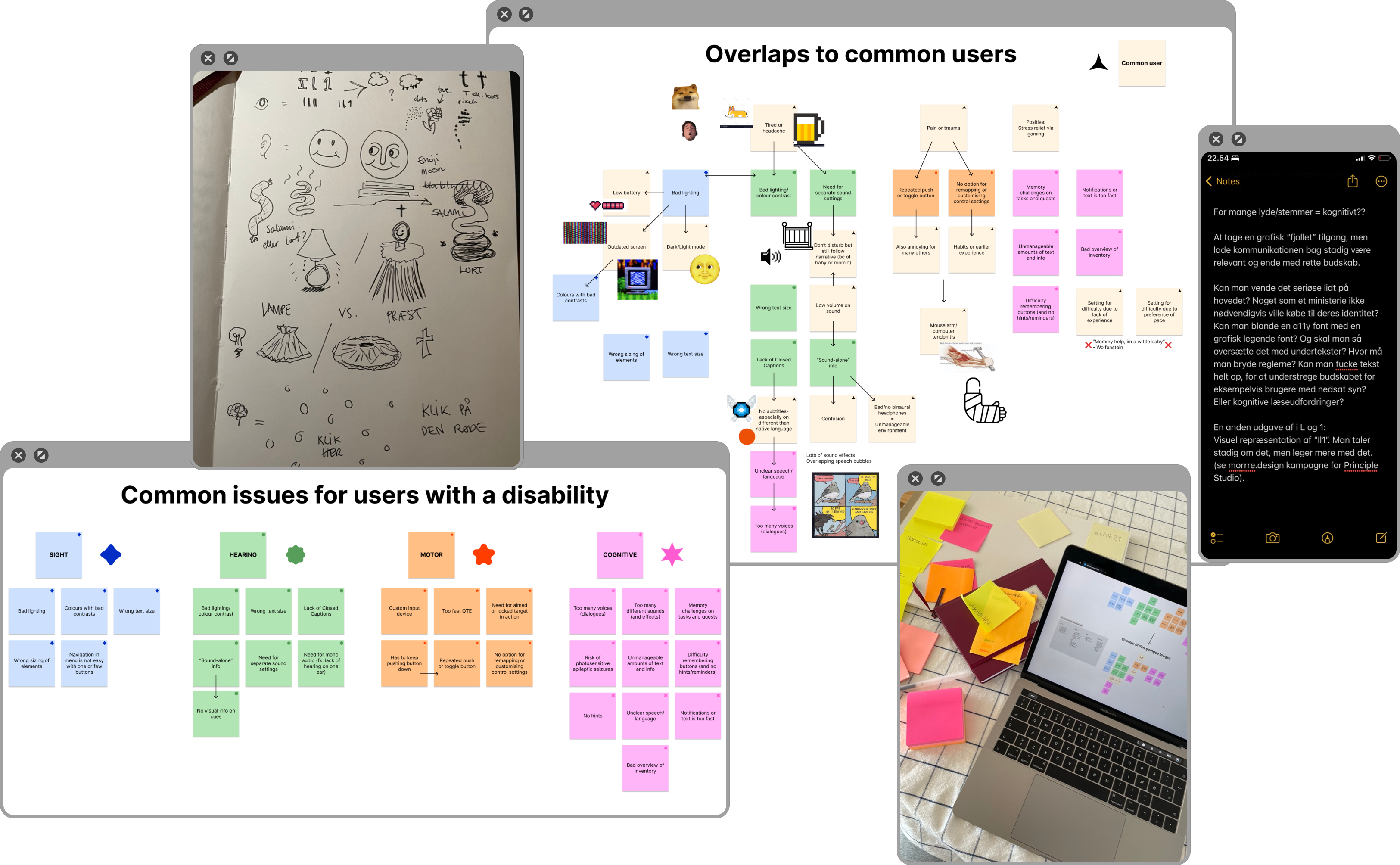
Process and Affinity Map
In my research in accessibility, I mapped the different elements of disabilities, the barriers, and possible accessible solutions, and find parallels as to how this may benefit the common user, therefore creating inclusion and comprehension for everyone.
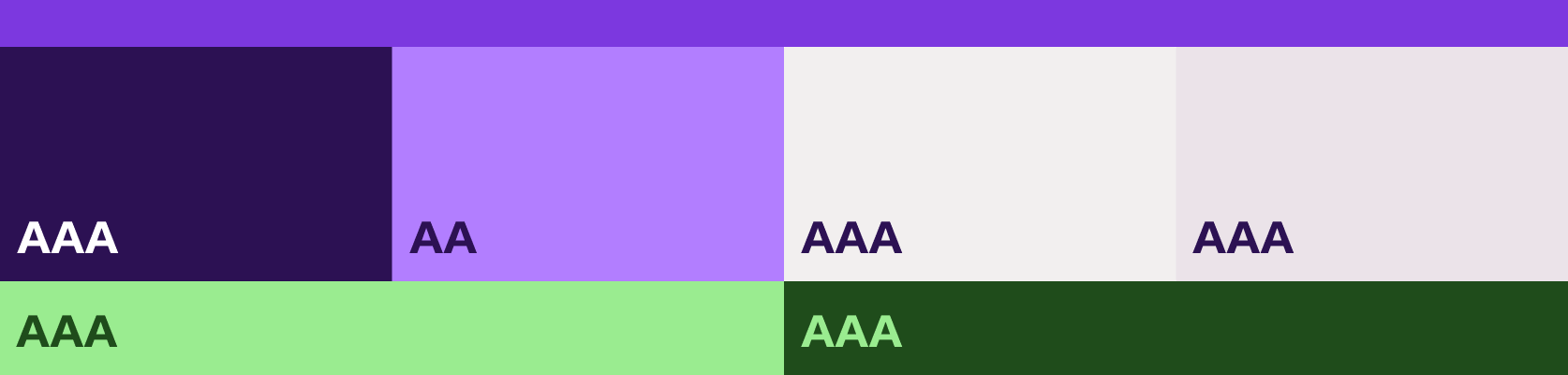
Colors
I took the original colors from Twitch's own identity, and adjusted them. The colors are tested for contrasts, AAA being the highest rating. This makes the text easy to read for the user. The green is inspired by the green tags from the AA and AAA-ratings, and is used in logos and icons, to make it more playful, and create an eye-catching experience.
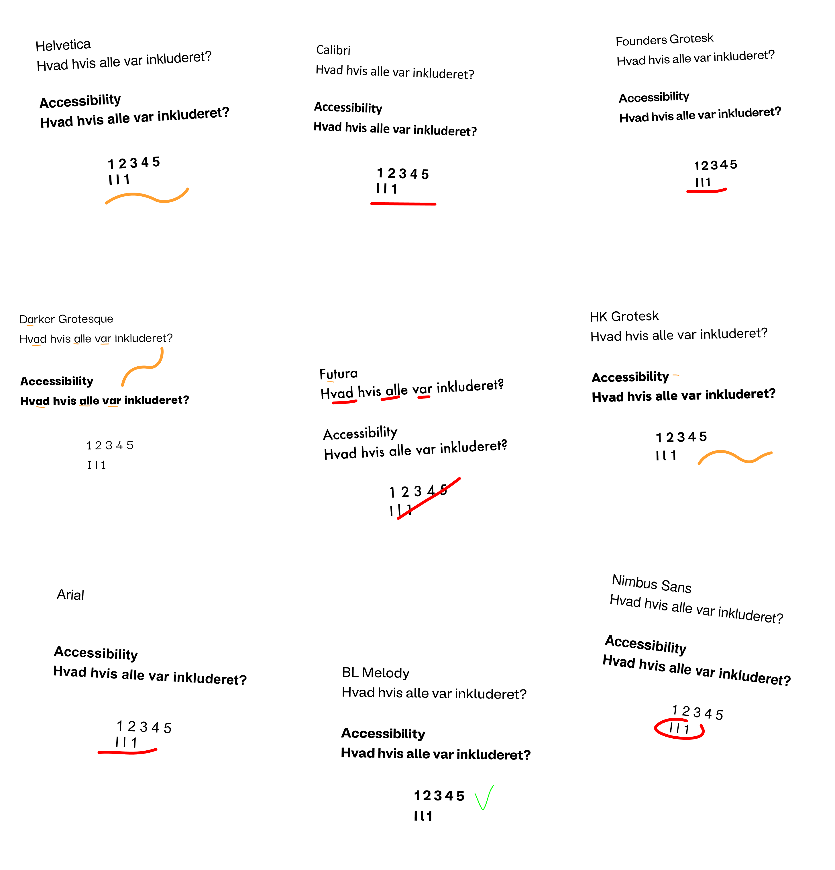
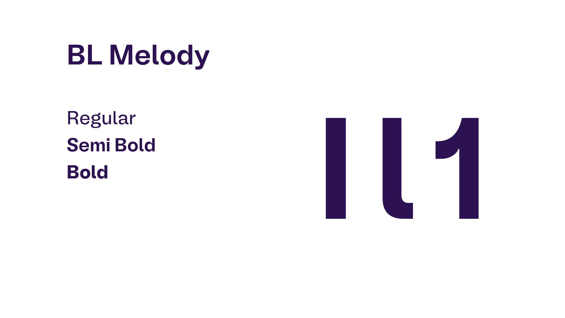
Font
I researched what makes a font accessible. One of the important constraints for me, was the difference between letters and numbers, in order to make text easy to read, for example a upper case "i", lower case "L", and the number "1".
(I, l, and 1 doesn't meet the requirements here, because the font sucks)

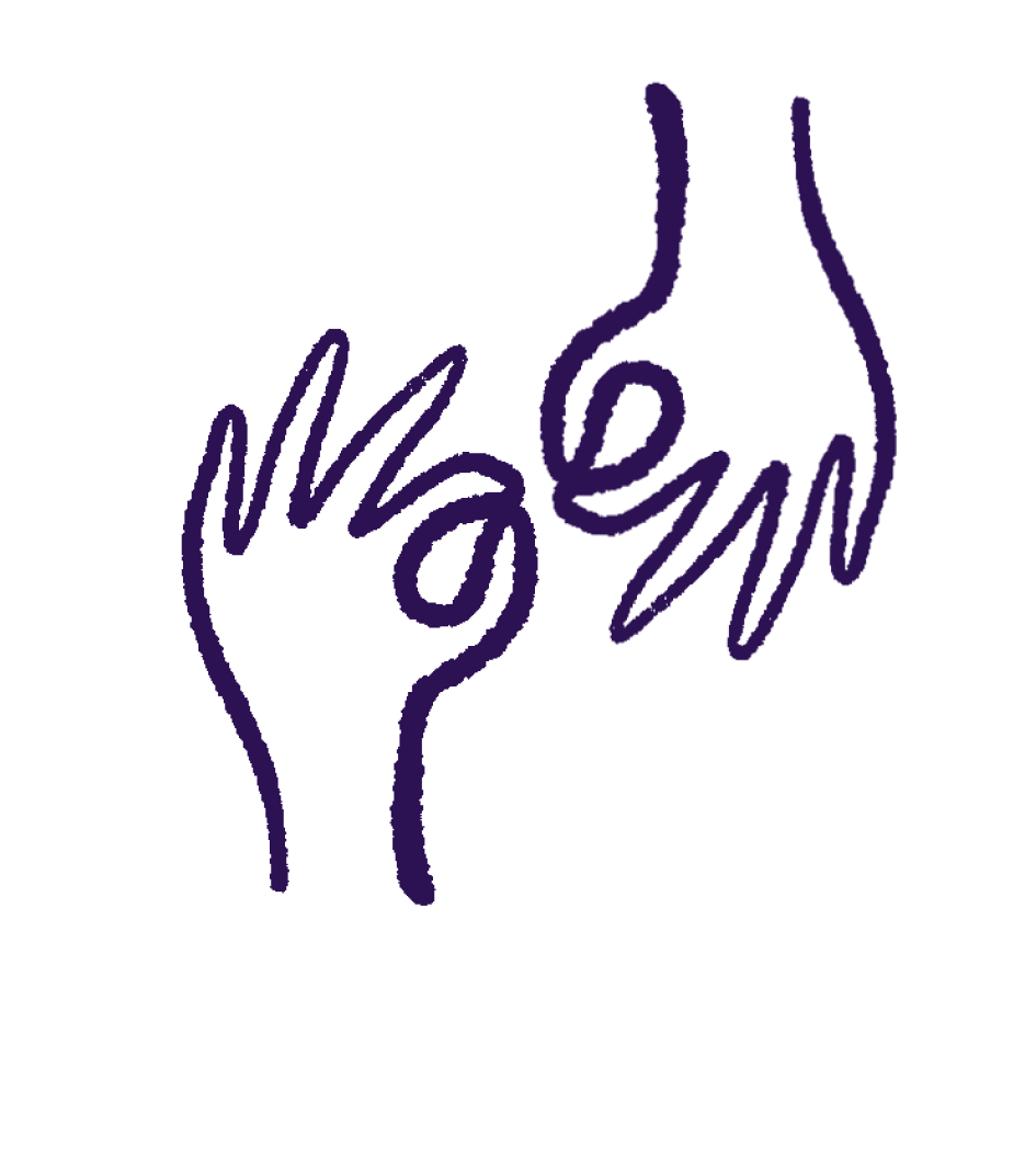
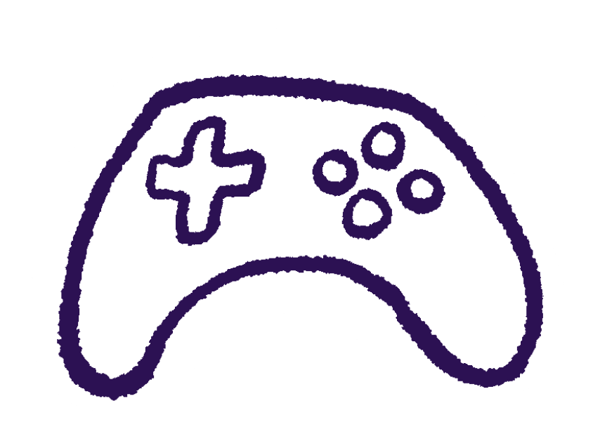
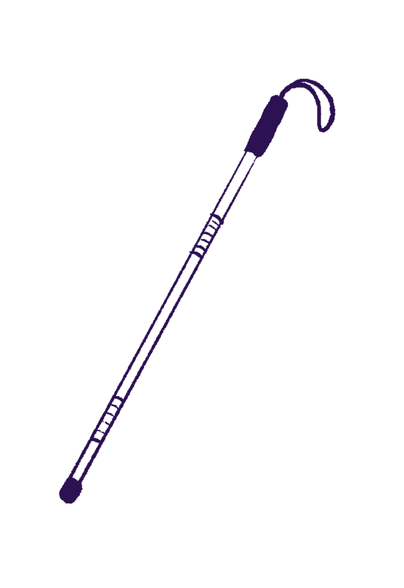
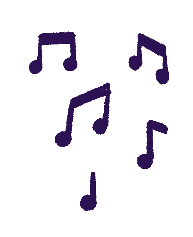
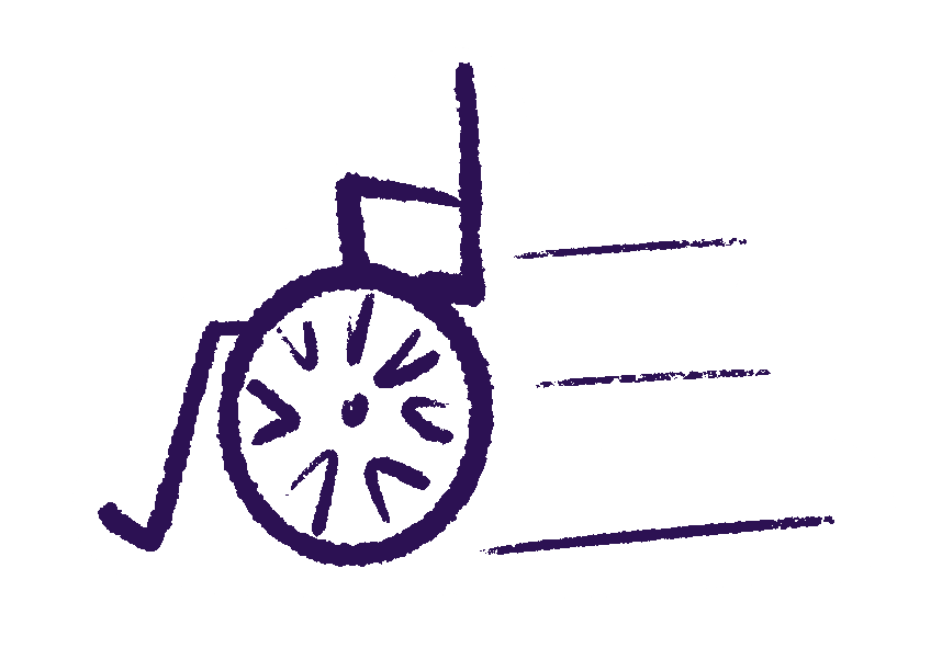
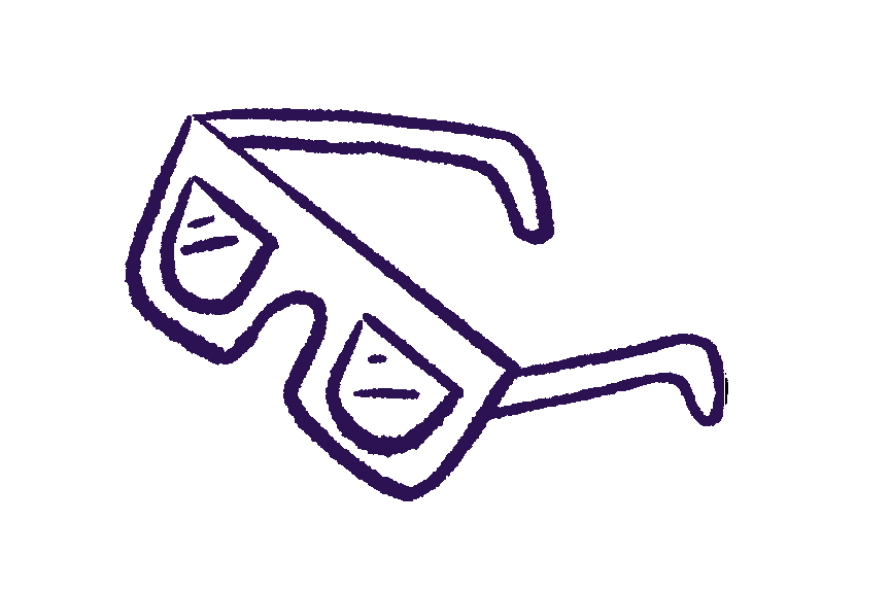
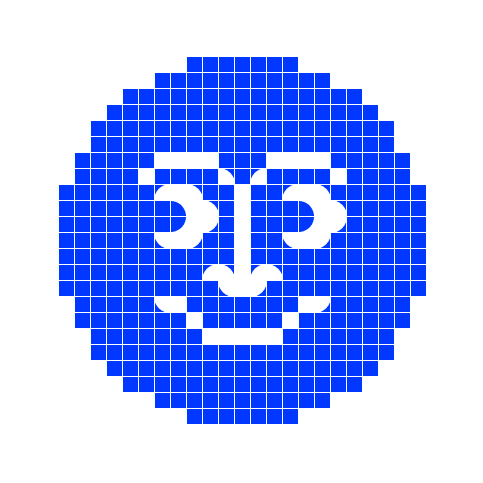
Assets and Illustrations
There are generally two types of assets, made in Figma and ProCreate:
- Pixel stickers which are retro game references
- Hand-drawn illustration, representing real-life objects


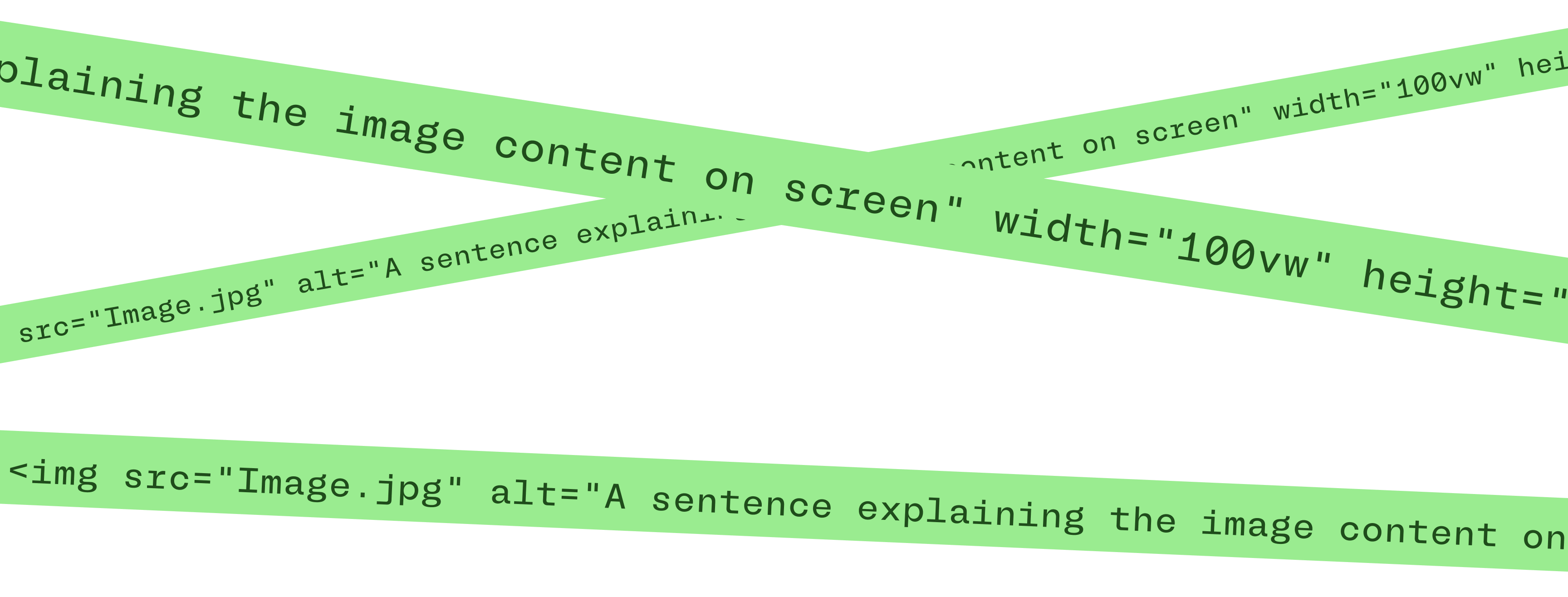
Alt Text
As a hint to the features of accessibility in coding, I included some dividers with alt-text: Explaining what images appear on screen, for those with impaired eye-sight. Also to give a tiny bit of insight in accessibility for the common user.
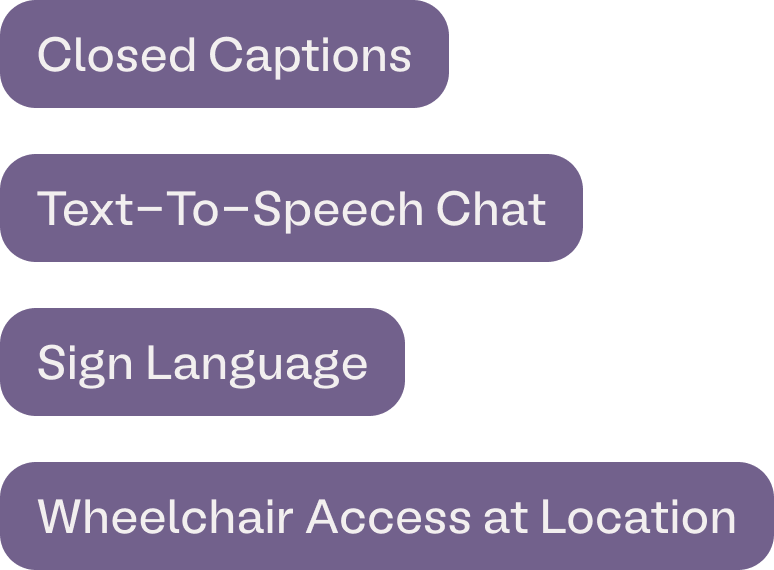
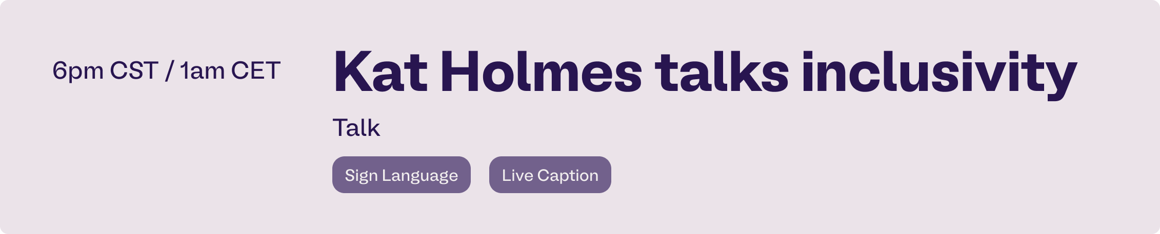
Accessibility Tags
When sharing the schedule of the community events, it would also be important to define which accessible elements are present, for the users to know, if the specific stream or physical event is accessible to them and their needs.
Instagram Campaign Stories
BONUS:
Stress Proces Video
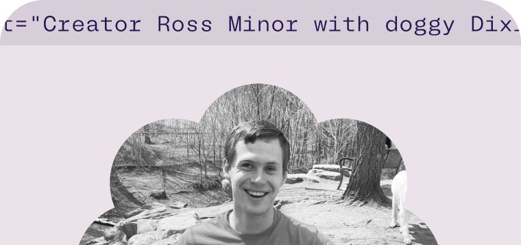
Thank you!
Julie Eide
hello@julieeide.dk
+45 60 22 36 93